Moodboards: the Most Important Step in the Branding Process
What is a moodboard?
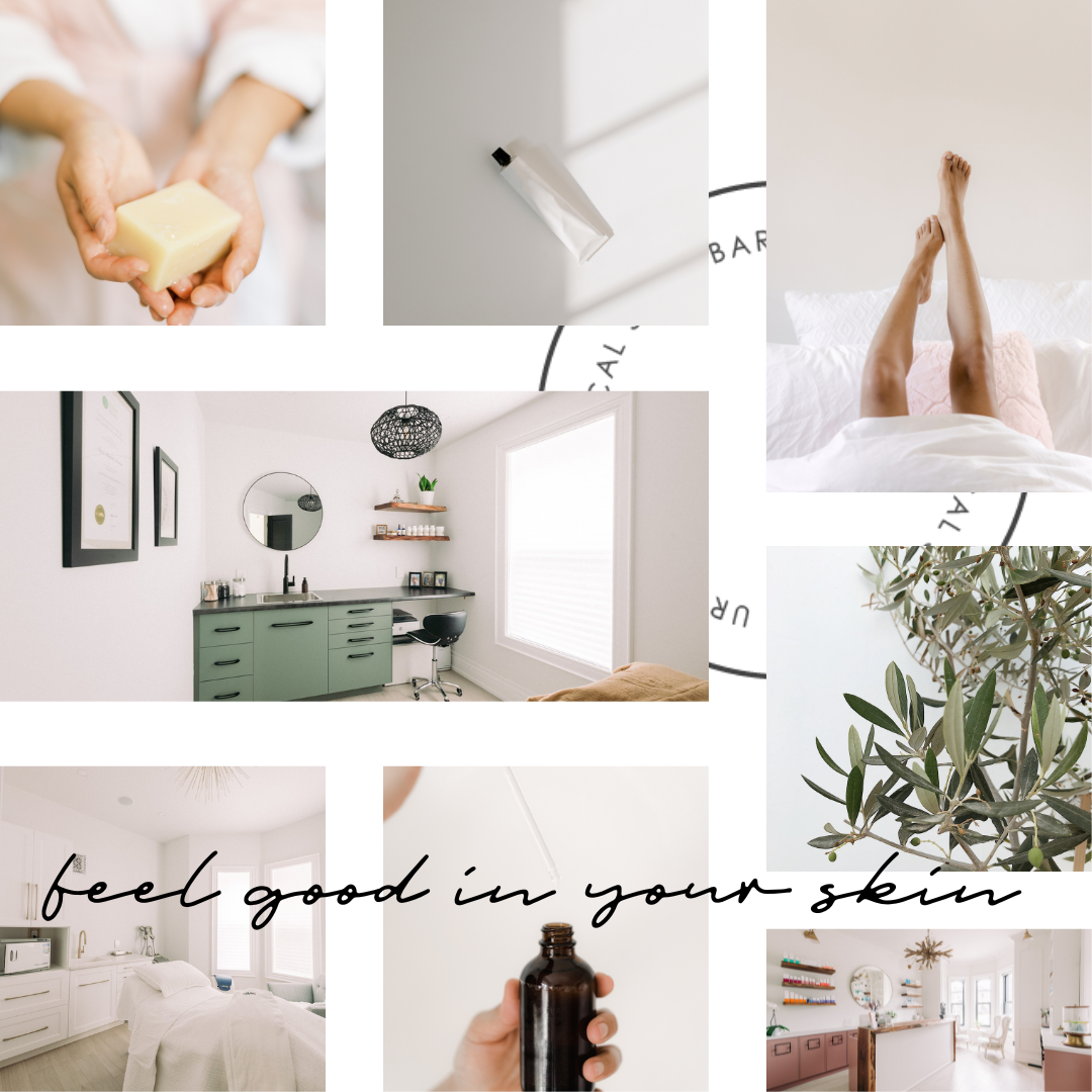
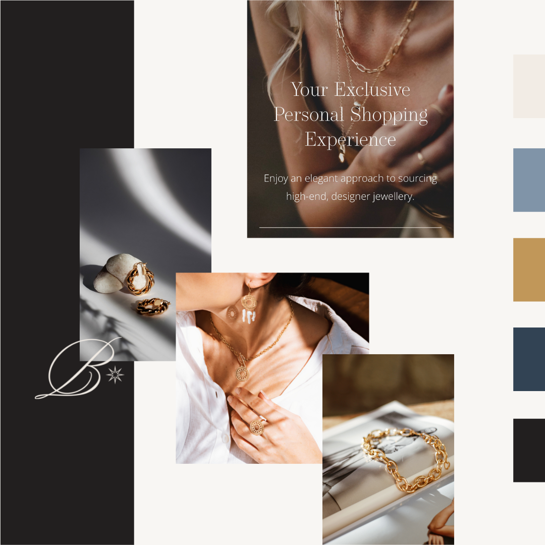
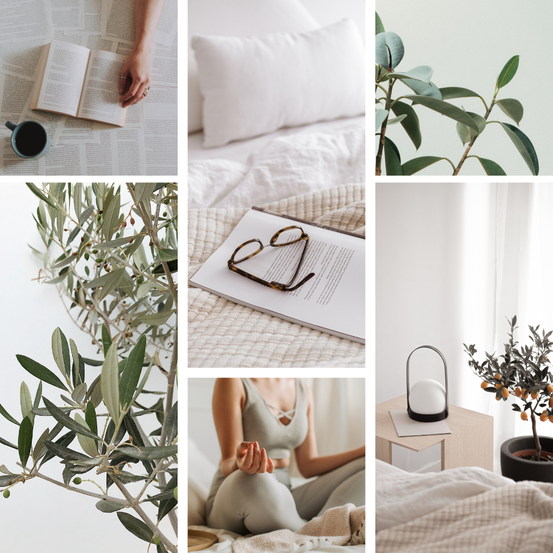
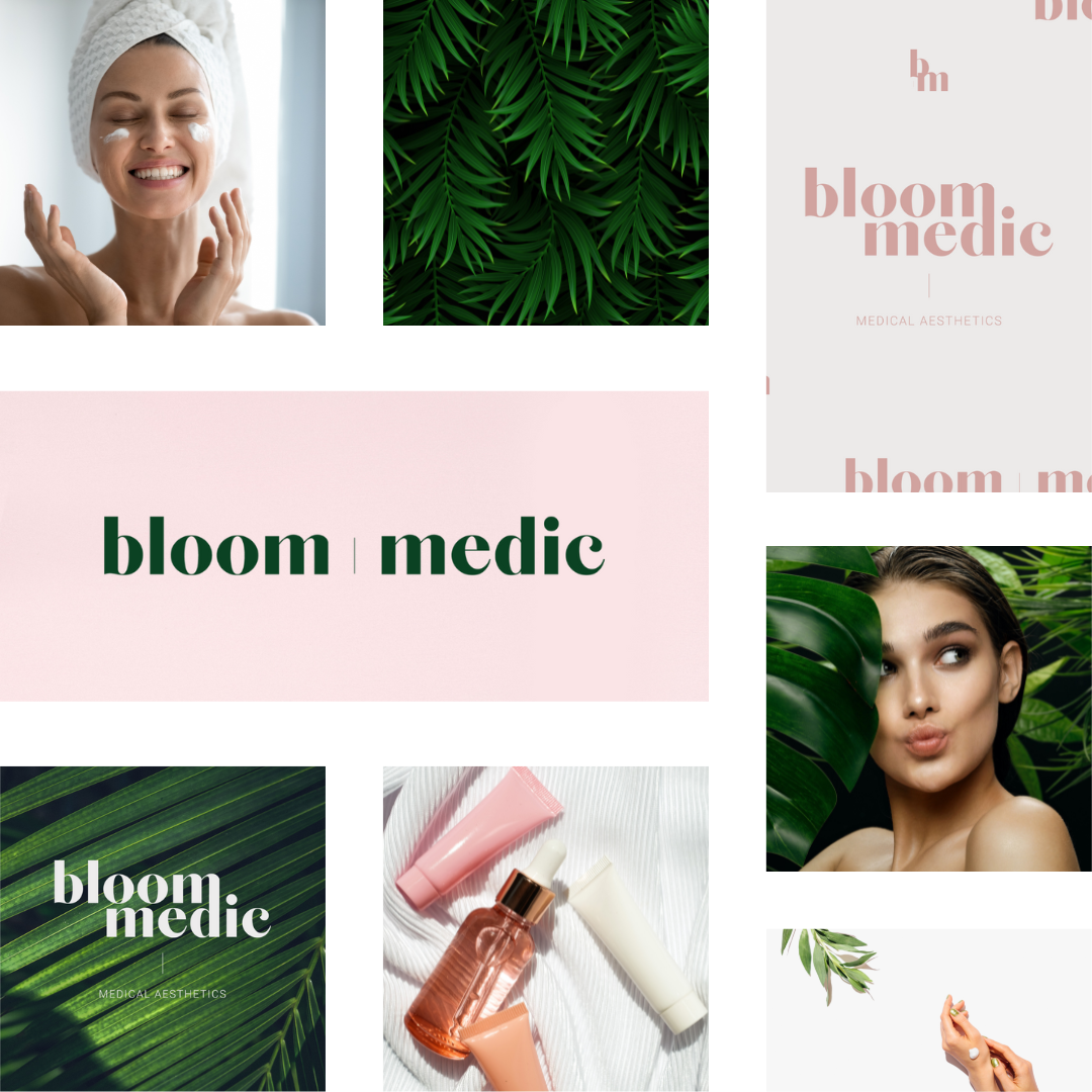
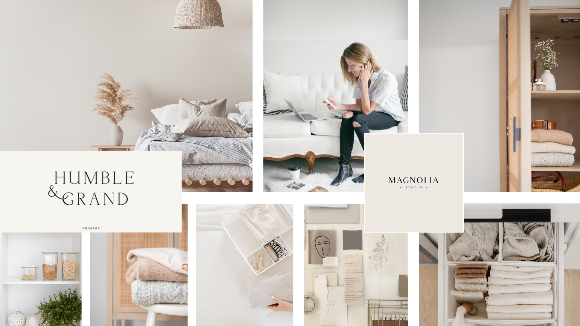
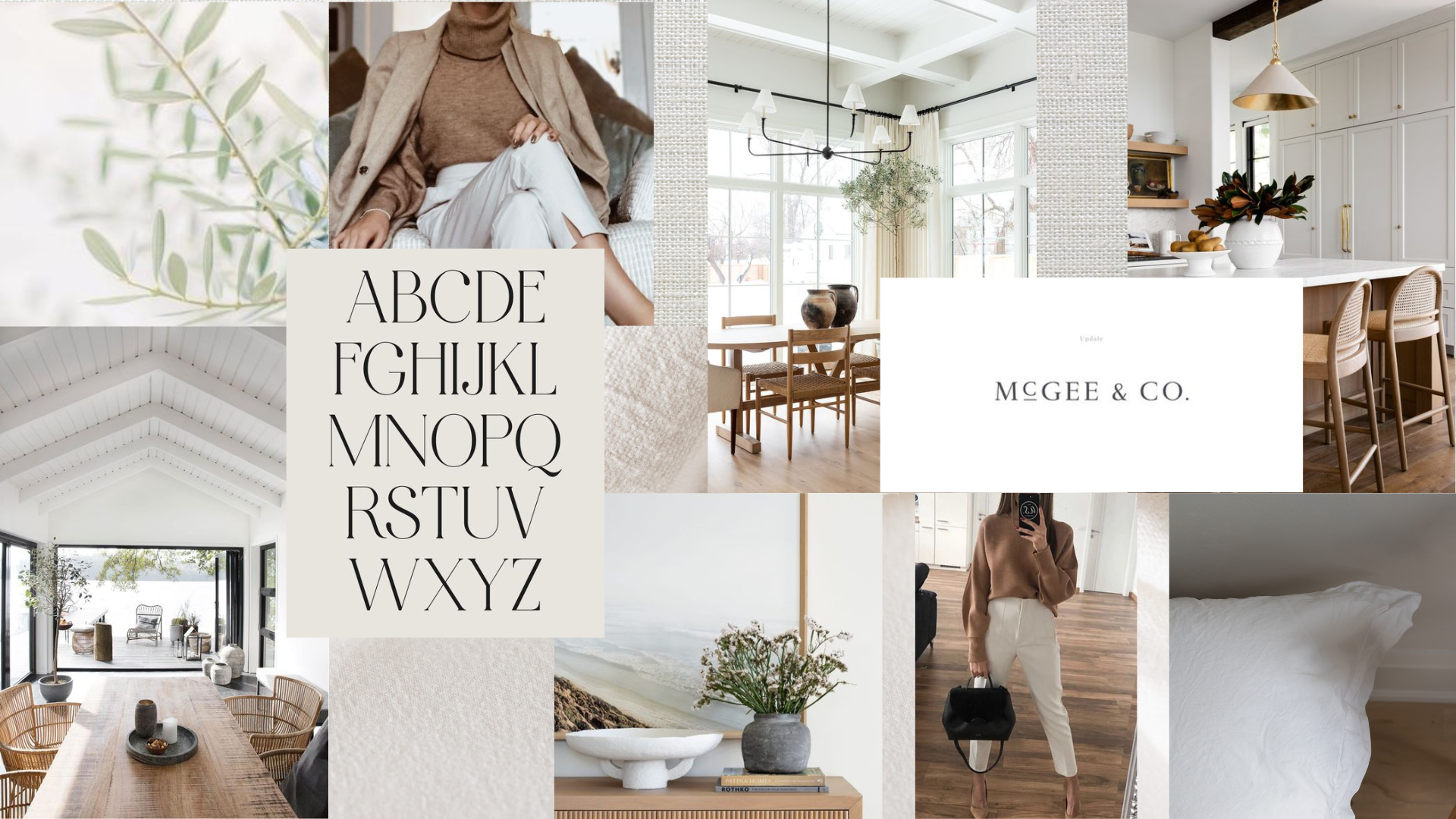
A moodboard is a succinct collection of visual assets that represents a brand’s visual identity. It can contain inspirational examples of photos, colours, typography, quotes, patterns, shapes and more that make up a cohesive direction for a brand that can be displayed and understood on one page.
Why are moodboards important?
1. Moodboards are the first visualisation of a client’s vision.
The reason I do what I do is to visualise my client’s visions. For a lot of entrepreneurs and small business owners, there can be a disconnect between the incredible vision they have in their head and what they have been able to outwardly present, especially if they’re not naturally visual people themselves.
For most, the creative work between these dreamers and the designers they partner with will be the first time they see the idea they’re so passionate about turned into something tangible that visually represents their dreams, and the moodboard is the perfect first step in this process.
Since the mood board isn’t something that is usually directly used as a final deliverable like logos, colours or typefaces, it means that the client can experience the joy of seeing their vision visualised without getting distracted by the finer details or worrying about the final outcome.
My clients are always buzzing after seeing the moodboard for the first time because they can finally see their dream becoming a reality and it’s the first step to their audience falling in love with their visual identity too!
2. Moodboards set up the visual direction for the brand.
Creating a moodboard at the beginning of the design process means that the barrier to entry to the next steps is lowered since a lot of the work has already been done! Maybe the colour palette was nailed in the moodboard and just needs some refinement; there might have been some inspirations for logos in there so there’s no need to go hunting for more; hopefully the imagery in the moodboard was perfect, so you can source or take your own based on those already!
If the moodboard is done well, it sets up the visual direction for the brand from the very beginning of the design process, ensuring that the following work is seamless and stays cohesive with the essence of the brand.
3. Moodboards show that the designer has listened to and understood the client.
When it then comes time to the moodboard, the first visual interpretation of the vision, this is a vital moment where the client can see whether the designer has listened to what they had to say and understood what it is they are trying to do and get other people on board with.
If the moodboard doesn’t represent what the client has discussed, it’s a pretty clear indication to them that the designer hasn’t listened, or has but doesn’t have the appropriate understanding of them and their business that is required to create an effective visual identity. That’s definitely not an ideal way to start a relationship with any client.
However, if the designer does nail it, it sets them off on a great foot with their client, as they’ll know that they heard them and understood their vision and goals well. Boom!
4. Moodboards can be used for sharing the process on social media.
Even if you don’t like to admit it, business owners have to always be on the lookout for ways to market your brand and promote what you’re doing. Moodboards are brilliant visual assets for both clients and designers to share the project and engage their followers in the design process.
While designers can use a moodboard to show their process in a case study, or as something fun for instagram, clients can use a moodboard as a great way to generate hype around their upcoming launch or updated visual identity.
It’s a win-win!
5. Moodboards are great references throughout and after the branding process.
When it’s time to choose a colour palette, create logos or select typefaces, the moodboard serves as a great reference point throughout the process. Both the client and the designer can refer back to the moodboard for ideas, inspiration and to ensure that the designs stay true to the initial vision for the brand.
I also always include the moodboard in the final brand guidelines that are delivered to the client at the end of the branding project, encouraging them to refer back to it if they’re unsure about selecting imagery, making graphics or creating anything else that could affect brand consistency.

